A Heat map is a unique two-dimensional display of data in which values are dictated in the form of colours. Generally there are two aspects of heat map, fractal maps and tree maps, and both of them employ similar colour coding to represent individual variables. The more elaborate heat maps display complex data sets in perceivable and simplified terms.
The simplest way to understand the exact meaning of heat map is to take an example of a table or spreadsheet containing colours instead of numerals. There are few default colours set in a spreadsheet. The dark set of colours is there to display the low activity whereas the brighter set of colours is set to indicate higher level of activity. On the other hand, the mid-range values are marked in light gray colour, with an equivalent gradient between these two extremes. Heat maps are perfectly suitable for visualizing a large amount of multi-dimensional data. They also help in identifying array of rows with diverse values, as these are exhibited in rows of dissimilar colour.
Originally, heat maps were represented in 2D displays of values in any data matrix. In such representations, larger values would be displayed by small dark gray and black squares (pixels) while the smaller values by the lighter squares.
In order to display any given data distribution on map, heat map is the most comprehensive, used tool in Google spreadsheet. From such simplified displays, one can easily grasp the entire trend of data distribution. Here, deeper tones of colour are used to display larger value. These maps can be used to portray market shares, population distribution and other valuable information.
With no visual charm added in maps, it can get tough at times to understand a few million rows of numerals. Here any interpreter can get stuck with question in mind like- What chance do I have of getting accurate information from this million of rows at one time? Or how do I get the exact value from all such kinds of data? However the unique colour coding used in heat maps makes such doubts vanish in the air. With eye catching visual display, it becomes easier to grasp the type of information you are looking for.
In the category of heat maps, there are twenty different tools, all of which can be used to create a clear, concise and visually attractive display charts. These include simple charts, complex designer graphs, maps, infographics and many more. All these tools and software are available online for free. These can be installed directly in your system.
Some common tools are Excel, CSV/JSON. Online visualisations are Google Chart API, Flot, Raphaël, D3 (Data-Driven Documents), Visually, Crossfilter, Tangle, Modest Maps, Leaflet, Polymaps, OpenLayers, Kartograph, CartoDB, Processing, NodeBox, R, Weka, Gephi and so on.
Here is the lowdown of important heat map software implementations:
Below given is the perfect example of value display. 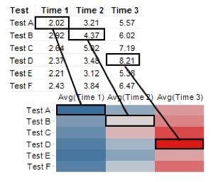 Here, the values showcased in the table are represented as varied colour gradients in the corresponding heat map cells.
As a final result of the clustering calculation, the rows given in the heat map have been re-shifted to conform to the cluster computation. In the example, test A and test E are positioned in the same cluster. And test F and test B are positioned altogether in another cluster. This cluster creates another cluster simultaneously with Test C. In this, the test D is not mentioned in any of these groups. This shows that Test A and Test E are closer to each other as compared to Test F, Test B, Test C, or Test D. It also depicts that Test D is the only one which is at more distance than any of the other rows.

"Started with one assignment, they satisfy all my analytics needs. Good quality, cost effective - Our godsend analysis partner we much needed."
Director, E-commerce company, UK